Written by: Chandler - Member of StreamingSoundtracks.com
"Create SST Wallpaper, Stationary, Flyer, Business Card, etc. (use you imagination)! We're really hoping for a cool
SST Wallpaper (ranging from 800x600 to 1600x1200). The winners' work will also be placed in the SST Downloads
section. The contest ends this Halloween."
Jeric - Webmaster of StreamingSoundtracks.com
So there I was. Sitting at work waiting, as usual, for some code to compile. To make the time go a bit faster I did some catching up on various forums I frequent when suddenly my eyes fell upon the assignment by my favorite internet radio station; StreamingSoundtracks.com. Flowing over with self-esteem I thought that this would be a fairly simple task, but I would soon be proven wrong. It all had to start with an idea. An idea I did not have. Several days passed with me trying to come up with one but to no success. So there I was; finished with the compiling and fixing some buggy code when it hit me. But it hit me at the wrong time. I don't have access to Photoshop at work and I couldn't wait until I got home because I would have forgotten all about it by then. so I had to draw my idea by hand. I'm not very good at hand drawing but I got my ideas down.
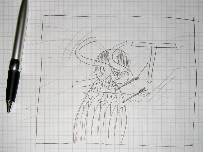
What is StreamingSoundtracks.com to me? Movie soundtracks all the time.
What is movie soundtracks to me? Great sound. What is great sound to me? Orchestral music. What is orchestral music to me?
Movie soundtracks. What is movie soundtracks to me?
StreamingSoundtracks.com. And that was the feeling I had to convey.
So I thought an image of an orchestra would be nice. And an orchestra also usually have a conductor, so I wanted a
silhouette of a composer. Orchestras produce music which is nothing more than a collection of sound waves, which I also
though would provide some good symbolic value. I also thought of some more stylized waves symbolizing the sound. Some sheet
music would be good too. After all this consideration I came up with this sketch.
The first thing I had to do to be able to create this wallpaper was gathering some good source material. Thank god for
Google Images. I guess I spent almost an entire evening of searching for "orchestra",
"symphonic", "note", "wave", "sheet", etc. The hard work paid off, though, and got me some good source material in high resolution.
 Click to enlarge |
 Click to enlarge |
 Click to enlarge |
 Click to enlarge |

I soon encountered another challenge. I needed a high resolution version of the logo from the StreamingSoundtracks.com (SST) website, but they only had a lowres one. Not nearly good enough to cover my needs. So I had to make it myself. Enter Photoshop; The most brilliant graphics package ever to come out on the computer (and it's also invented by one of my heroes. John Knoll of Industrial Light + Magic). I took the low resolution logo and traced a path around its blocky edges. This provided me with a basic outline of the logo. The wonders of paths is that they are vector based and therefor fully scalable without loosing any information or having the need for interpolation. So when I scaled the low resolution logo up to the resolution I needed, the paths were scaled with it and, voila, I had a nearly usable high resolution version of the logo. Since I had traced the logo in low resolution I didn't get all the details I needed in the path, so I had to tweak the paths a bit further to get exactly where I wanted, and to get a good and correct high resolution version of the SST logo.

With the paths I had traced I had tweaked to make the logo I added the text, which was a plain and simple Verdana font with some bolds and italics. Verdana is 100% correct thanks to some font guidelines I got from Jeric I now had a perfect version of the SST logo which I thought was pretty good. It was actually so good and correct since Jeric approved my version of the logo and even put it into an official development kit for the other contestants to use. So if you used the SST_Logo_Hires.psd-file from that development kit and you're wondering who provided the high resolution of the logo in that kit; you're reading his article.
These images gave me a great starting point, but I wasn't quite ready to arrange the bouquet just yet. I finally needed the stylistic sound waves. As it was really hard to find exactly what I wanted on Google I figured I'd rather make those myself as well. Back in Photoshop I simply drew a curved path and stroking it with white. I then scaled that curve down and moved it a bit, which in the end came out just what I wanted.

Almost time to start putting it all together, but I had two more details I need to take care of first.
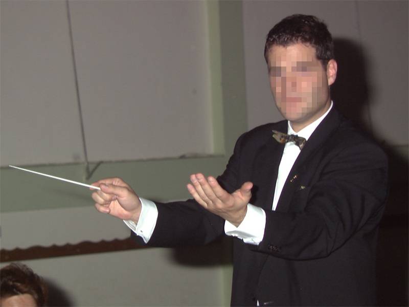
I couldn't use the
concuctor as he originally was. First of all he was a recognizable character. We're not allowed to use pictures of persons
who can get recognized as a main feature in an image without their personal consent. That wouldn't be a problem for me
anyway as I only needed his silhouette. That way there's no way you can recognize who it is in the picture. But making a
silhouette isn't just as easy as 1-2-3. You need a few more numbers. First of all I had to trace the entire conductor to
isolate him from the background. A process popularly called rotoscoping. After doing this I merely deleted the background
and filled the conductor with black, which gave a perfect silhouette. I then flipped the image to make the conductor point
in a more natural direction. There was still something missing, though, and that was his right hand (now his left hand due
to the flipping). You could only see the tip of that hands fingers, which is not what I wanted. I wanted the conductor to
seem to give directions to the orchestra, so I rotoscoped his left hand and placed it a bit furter to the right, giving the
illusion that the arm was protruding a bit further than it actually was.

The logo, well designed as it may be, just was a little boring to be used straight out of the box. I needed something to make it a bit more special. I tried some bevelling and embossing on the logo and playing with shadows, and though the logo was very close to be a perfect fit for my idea, it just needed a bit more panache. So I applied my secret procedure of making something metallic and made the logo gold. What? You want to know the secret ingredient? Let's just say it has to do with the Lighting Effects filter in Photoshop and some gradients and an image to reflect. The now nice and golden sheen still didn't seem fitting, even as exclusive a material gold is. After a bit more tweaking I ended up giving it a nice platinum finish (okay, it's really silver, but who can tell the difference).

With all the source material I needed I could finally start putting this puzzle together. First I had to choose a background color. I prefer my wallpapers to be dark in color, and blue is my favorite color. Blue also happens to be the primary color for SST so I took the blue color used as a background on their site and used the same color as a background for my wallpaper. I thought that would make a nice, subtle connection to the roots of the wallpaper.
Now I put in the silhouette of the conductor. To make it a bit more interresting and stand out a bit clearer I added a glow to it. That's easilly done by making a copy of the silhouette, fill it with a white color and making the silhouette all blurry with some Gaussian Blur and then put the blurred layer behind the original black silhouette. I think this produced a nice effect making the conductor go from a simple and boring silhouette to a more interresting silhouette, yet still simplistic in nature.
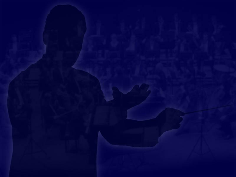
Now I added the orchestra to the background, very faint, but still visible enough so that other people will see what it is. Here I used the Linear Dodge Transfer Mode. Not for a particular reason but because it gave the look I wanted. The orchestra still standed out a bit too much, so I gave it some blur to make it a bit more diffuse. I struggled for a long time deciding wether the orchestra should be visible through the conductor or not, and decided it should. Otherwise there would be a big hole in the orchestra which didn't make any sense. Not that it makes more sense to have a semi-transparent conductor but it just looked better.

Time to add the other details. The stylistic waves was added to both sides of the image and made even less visible than the orchestra, but tstill visible enough to let your subconcious know they're there. This was also the time to add the platinum logo. I decided not to make the text below the logo platinum as well. Mostly to create a slight contrast, but again, because it looked good. I just added some bevel and emboss instead to give more depth to the text.
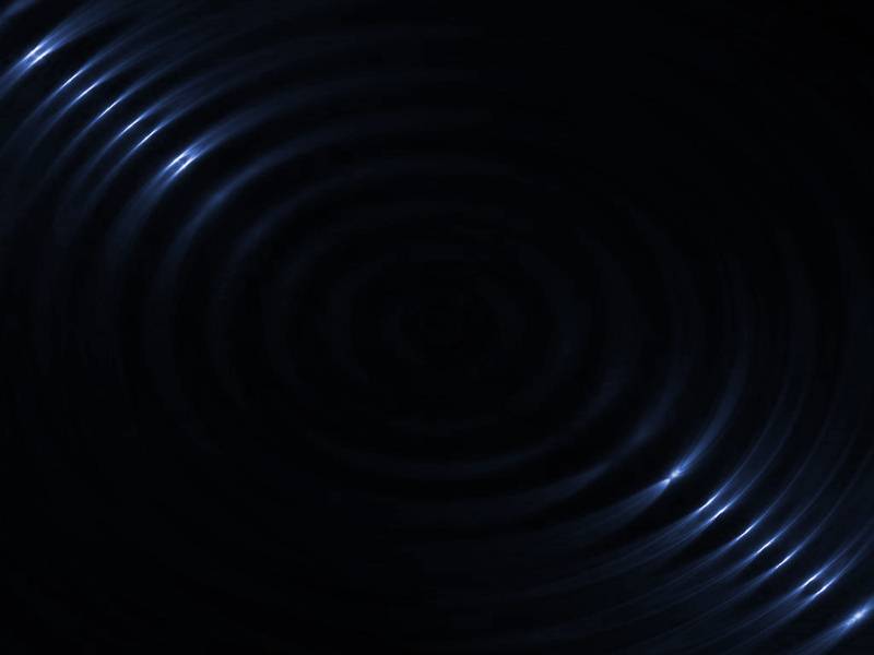
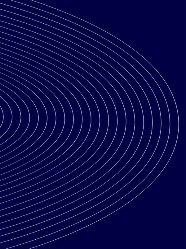
The only part missing now before it was complete was the sheet music and the ripples in a pond, illustrating the nature of SST.
Both by sending out radio and sound waves. I set the layer that contained the ripples to have a Screen Transfer
Mode to make it blend in better with everything else I had put into the image. With the sheet music I added some perspective
to the image and lowered it's opacity. I also placed it so that it gave the idea that the conductor was looking at it.
And with this final touch the wallpaper was now complete.

Of course there's a lot more work to it than what I have written here. I have no idea how many hours I've spent tweaking
every aspect of this wallpaper. The opacity of the orchestra, how dark the conductor should be, how much bevel there should
be on the logo text, how big the ripples should be and how much they should be visible. You can get some idea by looking at
the layers. There aren't really that many, but several have been combined to be easier to work with. But in the end I think
it turned out quite nice. Oviously I was not the only one who thought that since the nice Admins and Mods at
SST decided that I should win the contest. I owe them a big thanks.
I'd also like to give a huge kudos to the other participants in the contest. You all created great entries and I want to
share my podium with all of you.
BhelPuri,
Haurk,
Krissles,
Techo and
TrOn: Get right up here and receive the applause you rightfully deserve.

